In this tutorial, we will go trough some simple data visualisations that you can perform as first steps to explore your dataset. We will use Airbnb data on Berlin from Inside Airbnb and examine:
- the histogram of price
- the distribution of price by listing type (e.g. private room/ entire home)
- and the relationship between price and a listing attribute (number of reviews)
We will use the following Python packages:
- Pandas for data management
- Numpy and Scipy for calculations
- Seaborn and Matplotlib for visualisations
First, let’s import the required packages:
Importing and cleaning data
We will use the Berlin dataset from November 2019 :Our dataset consists of 24586 rows (Airbnb offers) and 106 columns (variables). First, we should clean our data from the offers that are not active any more, but are still available on the platform. Also, price is stored as string (e.g. 1,200 $), while we need floats, therefore we make some simple transformations: identify the number (1,200) and delete the separator.
Price distribution
Now we can begin our analysis. First, let's quickly see the standard measures of the distribution:
The average (91) is much higher than the median (59), which suggests a price distribution with a long tail. The maximum value is almost 9000 USD, therefore it makes sense to clean the data from outliers, e.g. cut off the top 2%. Also, we should filter the observations with 0 price. We can now visualise our dataset with a box-plot and histogram: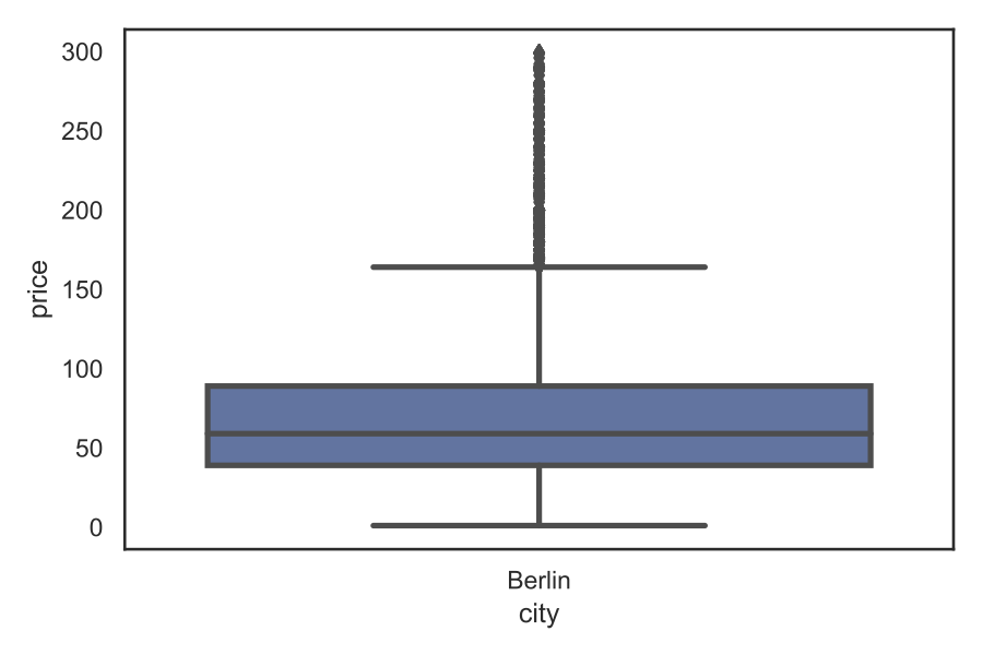
The box-plot shows the values for the quartiles (Q1-25%, Q2-50% and Q3-75%), the distribution outside ("whiskers" - the limit is 1.5 times the difference between Q3 and Q1, this is marked by the "antennas"), and outliers (observations outside the whiskers are plotted as dots).
Let’s examine the histogram of price.
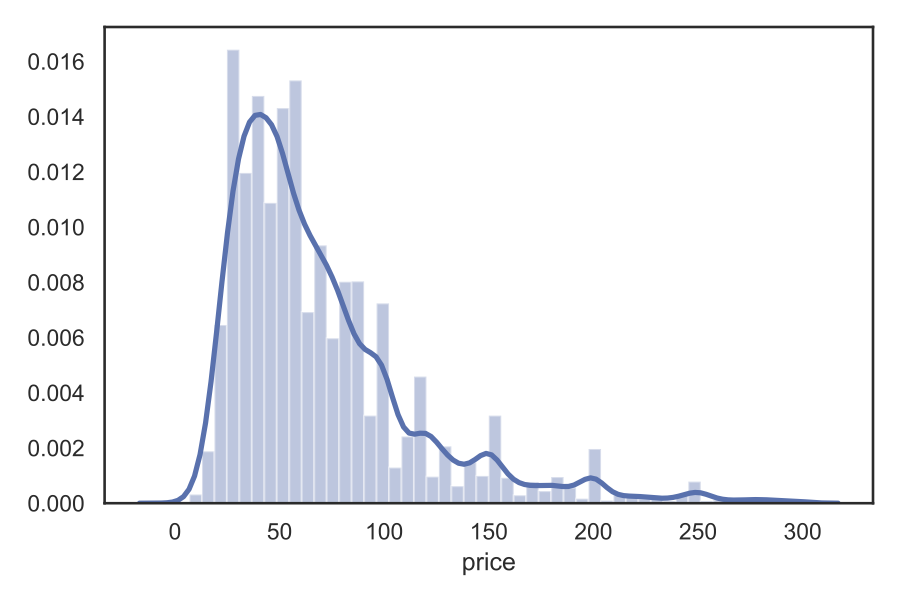
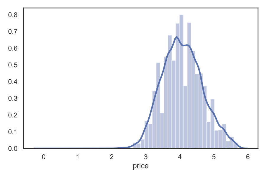
Indeed, we have a population with a skewed distribution. If we take the logarithm of price, the distribution will be much closer to Gaussian:
In the graphs, two things are combined: the histogram and the smooth line that is the kernel density estimation (KDE) of the distribution. With KDE, we can easily compare the distribution of two populations, e.g. the different listing types. Let's divide our sample into entire homes and private rooms:
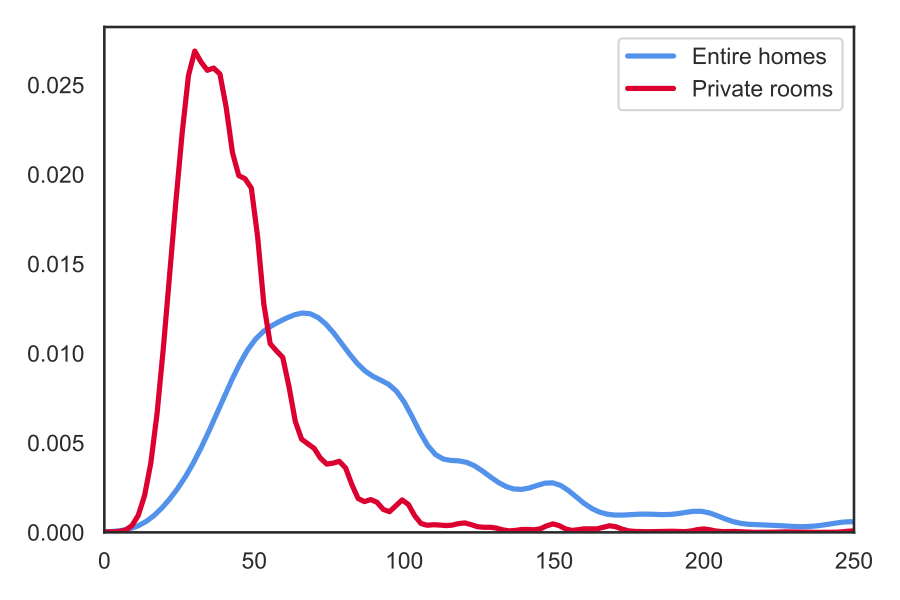
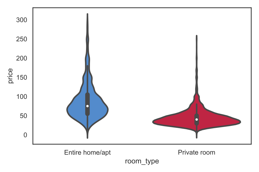
The figure reveals a clear segmentation: private rooms are much cheaper (median: 40) than entire homes (75).
A nice way to visualise distributions is the so-called violin plot: it takes the KDE of the population and presents it on the two sides of a box plot:
We can further condense the plot by splitting the two graphs and merging them into each other:

This way we have a clearer insight into the data from the box plot - the dashed lines provides the quartiles of the distribution (25th percentile, median, 75th percentile).
Relationship between variables
Finally, we can experiment with analysing the relationship between price and the listing characteristics. As an example, we can examine if there is a relationship between price and the number of reviews:
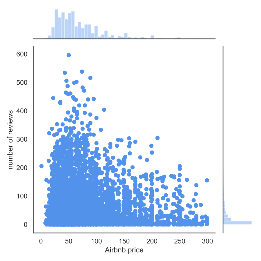
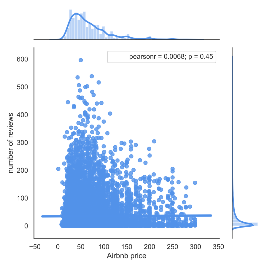
The first figure shows our dataset by the two dimensions. Based on the pattern of points, we cannot see a robust relationship, as most offers are characterised by a low number of reviews. We can verify this by calculating the Pearson's correlation coefficient and setting the regression line:
Conclusions
Before a deeper data analysis, it is essential to gain quick insights of the analysed dataset. The Seaborn package is a suitable tool to make the most out of our data with only a few lines of code. Moreover, the package is quite flexible with loads of customisation possibilities. This is a must in my data-science toolkit!